
 Chandeliers
 Pendant Lights
 Ceiling Lights
 Wall Sconces
 Table Lamps
 Floor Lamps
 Ceramic Lidded Jar
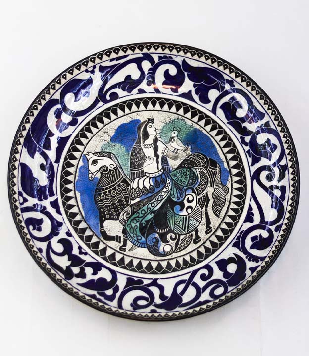
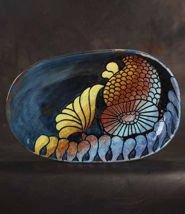
 Decorative Dishes
 Pomegranates
 Qajar Collection
 Decorative Wall Tiles
 Border Tiles
 Hand-Painted Tiles
 Block Tiles
 Wall Clocks
 Side Tables
 Candle Holders
Ceramic Decor Material Pairing: 9 Essential Design Rules

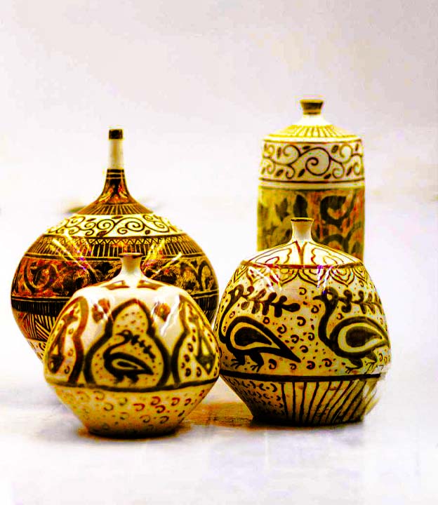
Table of Contents
ToggleIntroduction: Why Ceramic Decor Material Pairing Matters
Ceramic decor material pairing is the process of choosing ceramic objects in relation to the wood, stone, glass, metal, textiles and lighting already present in a room.
A refined interior is rarely successful because of one beautiful material. It becomes convincing when different materials balance one another. Wood contributes warmth and grain. Stone adds permanence. Glass brings lightness. Metal introduces edge and precision. Fabric softens hard surfaces. Ceramic connects these elements through clay, glaze, texture, colour and evidence of making.
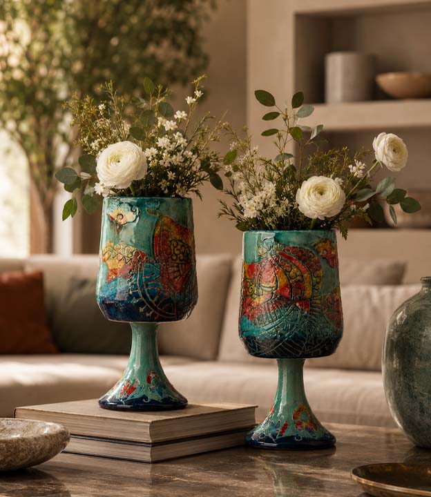
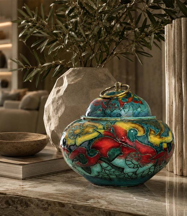
The same ceramic object can change character depending on its surroundings. A lidded jar on walnut feels warm and grounded. A glazed dish on travertine feels sculptural. A hand-painted tile beside brass becomes more formal. A ceramic pomegranate under warm light feels intimate and symbolic.
The goal is not to place more materials in the room. It is to decide which material should lead, which should support and what the ceramic is expected to contribute.
1. Give Every Material a Clear Role
Material richness becomes clutter when every finish competes equally. Begin by identifying the lead material in the room or composition.
In a timber-led interior, ceramic may add colour, glaze or sculptural contrast. In a stone-led room, it may soften the architecture. In a glass-and-metal space, ceramic may provide warmth and visual weight.
A useful hierarchy is one lead material, one supporting ceramic object, one contrasting accent and one lighting relationship. This keeps the arrangement layered without becoming visually noisy.
2. Pair Ceramic and Wood for Warmth and Craft
Ceramic and wood work naturally together because both retain visible material character. Grain, clay, glaze and hand finishing make the combination feel tactile and human.
On dark or heavily grained wood, use ceramic with a lighter body, controlled colour or reflective glaze so the object does not disappear. On pale timber, deeper blue, green, burgundy or earth-toned ceramics can create useful depth.
Rustic timber usually benefits from ceramic with refined form or a clean finish. Highly polished wood can be softened by matte or textured ceramic. The objective is harmony with enough contrast for both materials to remain visible.
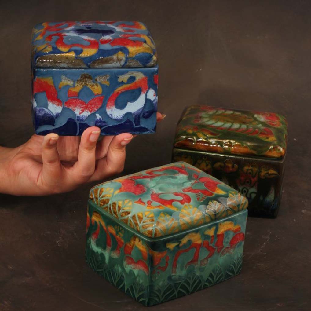
A ceramic lidded jar on a wooden console, an upright dish on timber shelving or a symbolic ceramic object beside a wooden lamp can create a complete interior moment without requiring many accessories.
3. Use Wooden Lighting to Reveal Ceramic Surface
Lighting does more than illuminate ceramic; it changes how glaze, brushwork, relief and colour are perceived.
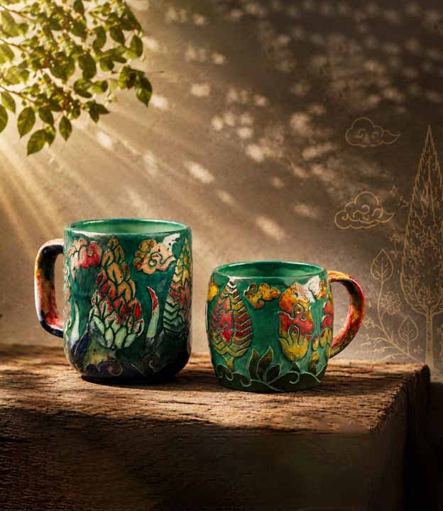
Wooden lighting adds a second layer of warmth. A glazed object near a timber lamp may appear deeper at night. A hand-painted dish beside warm light can feel more intimate. Side lighting can reveal relief on a tile or textured vessel.
Test the object during the day and after sunset. Highly glossy ceramic may create glare beneath a direct bulb, while matte surfaces may need more focused illumination. Warm colour temperatures usually strengthen earth tones, reds, greens and deep blues.
The light source should reveal the ceramic rather than compete with it.
4. Pair Ceramic and Stone Through Contrast
Stone gives interiors physical and visual weight. Ceramic introduces a more intimate, shaped expression of earth-based material.
Against heavily veined marble, choose quieter ceramic so the patterns do not fight. On plain limestone or travertine, a richer glaze or hand-painted surface can become the focal point. Glossy stone often benefits from matte ceramic; rough stone can be refined by a smooth glazed piece.
Consider scale and contact points. Use felt pads beneath display objects where needed, and avoid dragging ceramic across polished stone surfaces.
Stone grounds ceramic. Ceramic prevents stone from feeling impersonal.
5. Use Marble with Discipline
Marble has enough visual authority to dominate a composition. The ceramic should either calm it or respond to one of its tones.
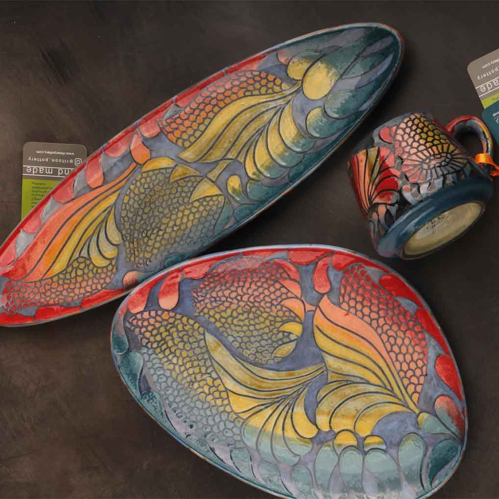
A cream or matte vessel can quiet strongly veined marble. A dark glazed jar can create elegant contrast on pale stone. A painted dish may work when its palette relates to the marble rather than introducing a separate competing pattern.
Avoid grouping several patterned ceramics on dramatic marble. Luxury depends less on the number of premium materials and more on deciding which one should speak first.
6. Pair Ceramic and Glass for Lightness
Glass creates openness, reflection and visual air. Ceramic contributes mass, colour and surface, preventing glass-led interiors from feeling sterile.
A ceramic object on a glass console becomes visually prominent because the support appears light. Inside a glass cabinet, ceramic can feel protected and curated. A glazed object near glass may gain reflected depth.
Use stable bases and consider the weight of the ceramic before placing it on glass furniture. Small protective pads can reduce scratching and improve stability.
Glass gives ceramic visual lightness; ceramic gives glass warmth and identity.
7. Pair Ceramic and Metal for Controlled Contrast
Metal changes ceramic quickly. Brass and bronze add warmth. Black metal sharpens the silhouette. Stainless steel and nickel create a cleaner contemporary effect.
A brass tray can organise a ceramic vignette. A black metal stand can make a painted dish feel gallery-like. A bronze lamp beside a glazed jar can create depth and formality.
Metal should usually remain an accent. Too much shine from metal, glossy ceramic, polished stone and glass can make the room restless. Introduce matte finishes, wood or fabric to restore balance.
8. Use Fabric to Make Ceramic Feel Livable
Ceramic is a hard material. Textiles help it feel connected to comfort and daily life.
Linen beneath a decorative dish creates softness. Upholstery behind a ceramic jar reduces formality. A woven rug, curtain or cushion can repeat one colour from a painted ceramic piece and connect it to the broader room.
Textiles are especially useful when ceramic and stone or metal already create a formal composition. They make the result refined but still welcoming.
9. Combine Multiple Materials Through Hierarchy
Most interiors contain several materials at once. The challenge is not variety; it is control.
For a console, ceramic may be the anchor, timber the warm base, stone the grounding accent, brass the refined note and lighting the atmosphere. On a shelf, an upright ceramic dish may lead while books, wood and a small metal detail support it.
Repeat no more than one or two colours across the composition. Vary sheen deliberately: glossy ceramic, matte wood, soft fabric and one metallic accent usually read more clearly than several reflective surfaces together.
Each material should have a purpose. Without hierarchy, richness becomes clutter.
How to Choose Ceramic for Existing Materials
Study the room before choosing the object. Note the dominant wood tone, stone pattern, metal finish, glass quantity, textile palette and lighting temperature.
If the room contains extensive timber, decide whether the ceramic should harmonise through warm neutrals or contrast through deeper colour. With visually active stone, select simpler ceramic. In glass-heavy rooms, use ceramic with enough form and texture to provide weight. Where metal is dominant, choose ceramic that softens the precision.
Photograph the intended location and compare the product dimensions with the surface. Colour alone is not enough; scale, silhouette and viewing distance determine whether the object will hold its place.
Ceramic Material Pairing in Minimal Interiors
Minimal interiors give every object greater responsibility. One ceramic piece may carry most of the room’s texture or colour.
Choose strong form, controlled surface and sufficient scale. A matte jar can feel architectural, a glazed dish can introduce depth and a single tile composition can prevent a wall from feeling empty.
Avoid adding several small objects simply because the space appears bare. Negative space is part of the material composition.
Ceramic Material Pairing in Warm and Layered Interiors
Layered rooms already contain textiles, books, art, rugs, wood and decorative detail. Ceramic should connect these elements rather than add another unrelated pattern.
Use a painted dish to echo one textile colour, a lidded jar to add height to a sideboard or a symbolic pomegranate to bring warmth to an entrance. If the room is already patterned, choose quieter ceramic. If it lacks focus, use one stronger statement piece.
The richer the room, the more important the editing.
Ceramic Material Pairing for Dubai Homes and Villas
Dubai homes often combine bright daylight, marble, travertine, timber, glass, brass and neutral upholstery. Ceramic can soften this palette and introduce handcrafted detail.
In large villa entrances and double-height living areas, choose objects with enough height or colour contrast to remain visible from a distance. In apartments, one well-placed dish, jar or tile composition may be more effective than a crowded collection.
Test glossy ceramic near windows because strong sunlight can create glare. Keep valuable pieces away from circulation routes, unstable edges and surfaces exposed to frequent cleaning activity.
Ceramic Material Pairing in Commercial Interiors
Hotels, restaurants, boutiques, reception areas and showrooms need material combinations that visitors remember.
Ceramic with wood can create hospitality and warmth. Ceramic with stone can feel established and refined. Ceramic with glass can feel curated. Ceramic with metal can create a more contemporary identity.
For professional projects, confirm dimensions, weight, mounting method, finish, quantity, expected variation and replacement availability. The ceramic should support the brand atmosphere rather than appear as a late decorative addition.
Common Material-Pairing Mistakes
Using several strong materials at equal intensity creates visual noise. Establish a lead material.
Matching everything too closely makes the room flat. Aim for harmony, not sameness.
Combining glossy ceramic, polished stone, glass and shiny metal without matte balance can make the composition restless.
Ignoring scale weakens the result. A small ceramic object may disappear on a large marble console, while a heavy jar can overwhelm narrow glass furniture.
Finally, do not treat ceramic as filler. It should solve a clear material, visual or emotional need.
A Practical Material-Pairing Formula
Use this structure: one ceramic anchor, one warm material, one grounding material, one refined accent, one lighting relationship and visible negative space.
Console example: ceramic lidded jar, timber console, stone tray, brass lamp and warm light.
Shelf example: decorative ceramic dish, wooden shelf or books, small stone accent, black metal detail and soft shelf lighting.
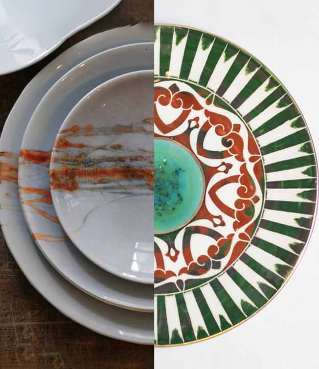
Dining example: hand-painted ceramic dish or tile, wooden table, linen, one brass or glass accent and a warm pendant.
The formula is not a rule for identical styling. It is a hierarchy that prevents random accumulation.
Care and Surface Protection
Use felt or silicone pads beneath ceramic objects on timber, polished stone, metal and glass. Lift pieces rather than dragging them.
Clean decorative ceramics with a soft dry cloth or a slightly damp cloth followed by immediate drying. Avoid abrasive cleaners, especially on hand-painted, metallic, textured or delicate glazed surfaces.
Confirm weight and mounting requirements for wall tiles and displayed dishes. Do not assume a decorative ceramic object is food-safe, outdoor-safe or suitable for holding water unless the product specification confirms it.
Why Ceramic Works Across So Many Materials
For broader context, the V&A Ceramics Collection demonstrates the range of ceramics across pottery, porcelain, studio ceramics and tiles from different regions and periods.
Ceramic is unusually adaptable. It can be matte or glossy, pale or deeply coloured, smooth or textured, sculptural or functional, quiet or highly patterned.
That flexibility allows it to warm glass, soften metal, enrich wood, contrast stone and connect textiles with architecture.
The strongest ceramic decor material pairing happens when the object is selected with a clear purpose: to warm, ground, soften, structure, reflect light or create a memorable focal point.
Explore Ceramic Decor at Checkmark Trading
At Checkmark, our ceramic collection is selected for interiors where craftsmanship, material warmth and artistic presence matter.
The collection includes ceramic art objects, decorative ceramic dishes, ceramic lidded jars, ceramic wall tiles, ceramic pomegranate decor, glazed pieces and hand-painted ceramics for refined homes, villa interiors, hospitality spaces and commercial design projects.
Whether paired with wood, stone, glass, metal, fabric or warm wooden lighting, ceramic can bring balance, texture and quiet distinction into an interior.